Heeeey there,
I'm back from the holidays, hope you had a great break too.
Working with several clients at once makes it hard to actually take time off, but New Year's is easier to step away. Hell, my Scandinavian client took all of December off. (Must be nice, super jealous)
As you can see, I took some sweet time too, but I was mostly prepping for this year (and watching the last season of Stranger Things…).
In 2026, Ghosted is moving to a new focus: the upgrade motion. We’re going to devour the psychology behind free-to-paid conversion. No more generic fun facts for fluff and giggles. Just the hard science of why users pay or disappear.
Anyway, I hope you missed Ghosted like crazy, so let's get into it.
The Ghosted Moment
Late last year, one of my clients was stuck in a very familiar SaaS fight: “Should our trial be No Card or Card Upfront?”
Growth: “No card, we need volume.”
Founder: “Card upfront, I don’t want to fund tourists.”
Classic.
They were arguing feelings. So we pulled it back to three hard realities.
1) The conversion math
For high-touch B2B SaaS, the benchmarks look more like this:
No-card trials
~8.5% visitor → trial
~18% trial → paidCard-upfront trials
~2.5% visitor → trial
~60% trial → paid
So yes, less friction gets you more trials.
But card upfront usually gets you more serious accounts with higher activation and better revenue per trial.
2) The activation gap
If your product is effort-heavy (data tools, infra, team platforms, course builders), a lot of “no card” users drop the second setup gets boring.
They lose nothing by quitting. A credit card acts like a tiny commitment: “If I’ve given you my card, I may as well try to make this work.”
That push through the annoying setup phase is where activation (and future upgrades) actually live.
3) The cost reality
If every trial costs you something real (AI tokens, storage, human review, support), then every non-serious user is not just noise, it’s burn.
A card wall is a filter. Not for “nice people” vs “bad people”, but for intent.
So yes, for many teams Card Upfront makes sense.
But if you keep the wall, you have to answer a different question: “How do we stop this wall from scaring off the right users?”
That’s where psychology comes in.
What’s Behind It
1. “You said free. Why does this look like a checkout?”
Feeling: Suspicion, “something’s off here”.
Pattern: Cognitive Dissonance & Ambiguity Aversion
What’s happening: their brain is holding two conflicting stories at once: this is a free trial vs this looks like a normal purchase flow. Cognitive dissonance kicks in, and because the signals don’t match, ambiguity aversion does the rest. When things feel unclear, the safest option is to do nothing.
2. “Can I actually get this set up before the trial ends?”
Feeling: Performance anxiety and pressure.
Pattern: Self-Efficacy & Temporal Myopia
What’s happening: this isn’t about the price, it’s about self-belief. They look at a 14-day limit, think about their actual week (meetings, deadlines, kids, life) and quietly decide they’re not going to finish setup in time. For high-effort products, the trial feels like a test they’re about to fail, not an opportunity to win. Temporal myopia makes them focus on the short window, not the long-term upside.
3. “If this doesn’t work, am I stuck?”
Feeling: Fear of entrapment and future hassle.
Pattern: Loss Aversion & Reactance
What’s happening: people really care about keeping the exit door open. Past subscription horror stories plus loss aversion (losing money and time hurts more than potential gains feel good) create a simple rule: better not start than get trapped. When the way out isn’t obvious, reactance kicks in, they push back just to protect their freedom of choice.
3 questions you must answer to move forward
You can paste this straight into Slack:
Does the UI clearly show they’re not paying today?
Do we give them enough time to realistically succeed, or just stress them out?
Do people see an obvious way out before they commit?
If the answer is “no” to any of those, that’s where your trial ghosts you.
How to Turn It Around
Kajabi is a good example here.
It’s a high-effort product (build a full course), so “card upfront” is actually rational: they want people who will push through.
But they do something most teams skip: they design the UI to answer those three questions directly.
Let’s go one by one.
Question 1: “Am I paying now?”
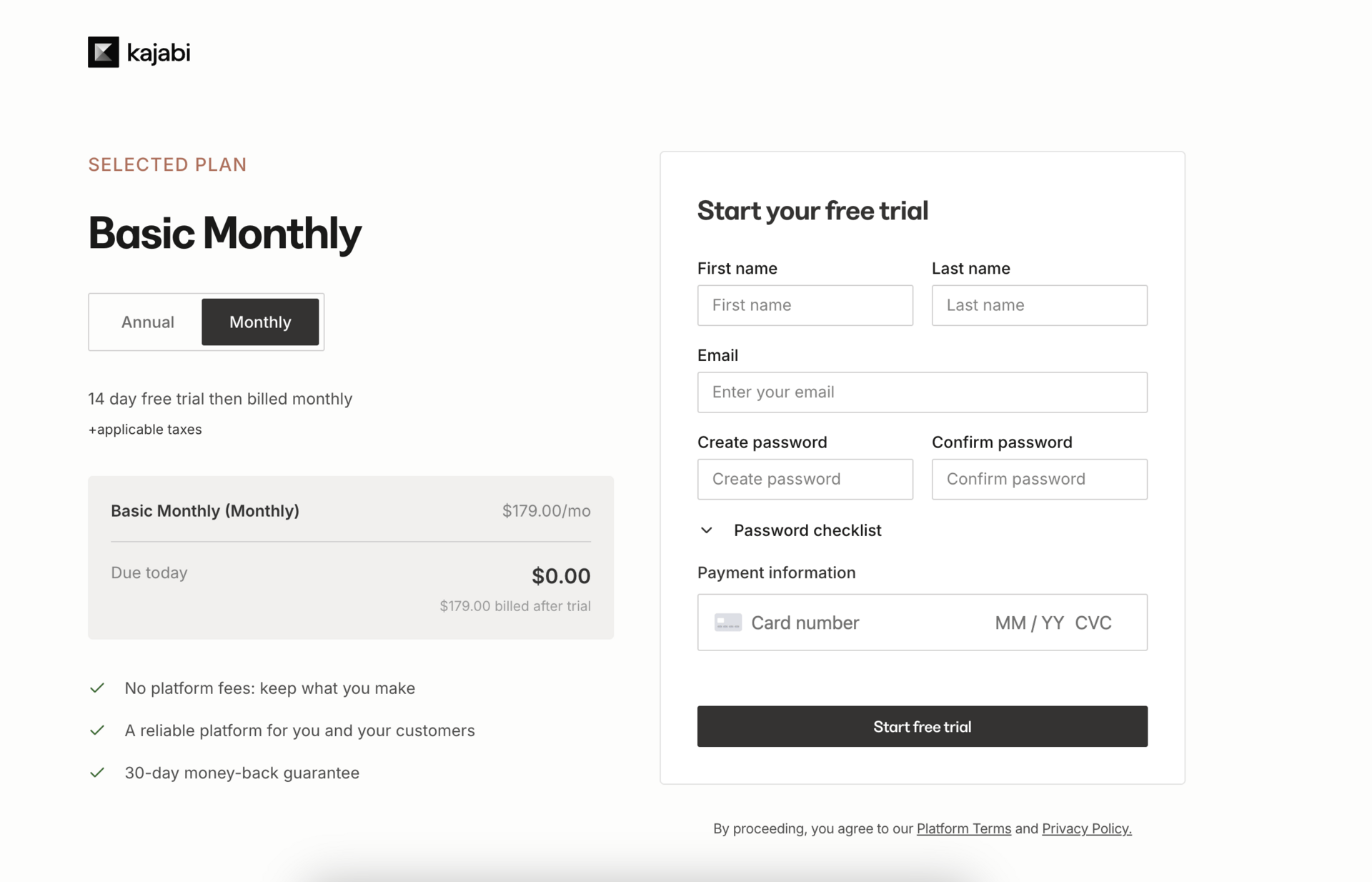
Kajabi’s answer: they put “Due today: $0.00” in huge type right next to the plan name and card field, plus a clear line “14-day free trial then billed monthly,” so it’s obvious nothing gets charged today.

Question 2: “Do I have enough time to get value?”
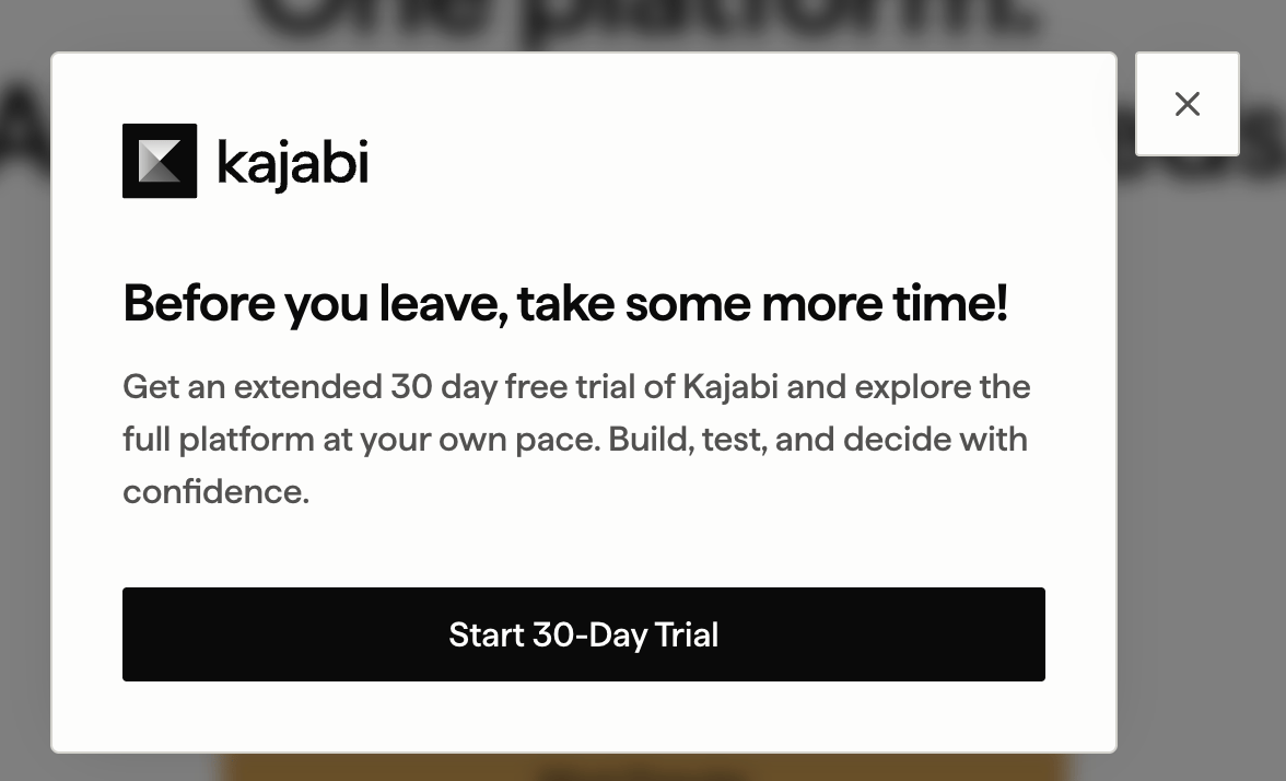
Kajabi’s answer: when you hesitate for 5 seconds on the pricing page or move to close the tab, they show a popup: “Before you leave, take some more time!” and extend the trial to 30 days. Same product, same price, more time to actually build.

Question 3: “Can I get out if this doesn’t work?”
Kajabi’s answer: under the plan details they highlight “30-day money-back guarantee” and other safety notes, so you see the exit door before you even start the trial.

If you forget everything, remember this:
Card upfront isn’t evil. It’s a filter.
For effort-heavy products, a “No Card” trial often creates a graveyard of inactive accounts and fake “growth”.
If you choose a card wall, don’t apologise for it.
Just over-communicate safety:
Show $0 today
Give enough time to succeed
Make the exit door obvious
Then the wall doesn’t feel like a trap; it feels like a serious commitment for people who actually want the outcome.
🎉 Woow, you finished the issue, that’s awesome!
Hi, I’m Anastasia Kudrow, and I write Ghosted.
I am also a product growth consultant. I help SaaS teams apply psychology and PLG to build growth they can actually control. I run my own project, Growing Pains, and also work with one of the leading PLG consulting agencies, ProductLed, led by Wes Bush.
Feel free to follow me on LinkedIn: https://www.linkedin.com/in/anastasia-kudrow/
Or check out my website, maybe we can work together: https://www.growingpains.consulting/
See you next week!


