Hi everyone!
As a responsible adult, I decided to plan my birthday waaay in advance this year. It's only in March, but I like to travel, have friends all over the world, and aligning schedules is tough because we're all busy with something fun work.
And somewhere along the way, I discovered the most horrible UX I've ever seen. You know where?
On the website of every. single. embassy.
Boy oh boy, it's like they're actively trying to make the visa process so hard that you'd bail somewhere along the way.
Forget about finding where to start.
If you somehow manage that, quite often you never know what will actually happen after you push a button. It's a horrific surprise every time.
You think I'm exaggerating?
I am…
But bottled with emotional reaction, this is how it feels. And you know what? Even if you think your product is perfectly clear, your users might still feel the same.
Most teams don't notice when users get distracted mid-flow. The best ones keep users focused on micro-goals and commitments that move them forward. And that's exactly why users leave or stay.
Find of the week
You won't believe it, but today's find is from Beehiiv. Last week I was speaking at a conference about why I chose the platform, and one of the things was their smooth growth engine and way bigger user-centricity than, in my opinion, Substack offers.
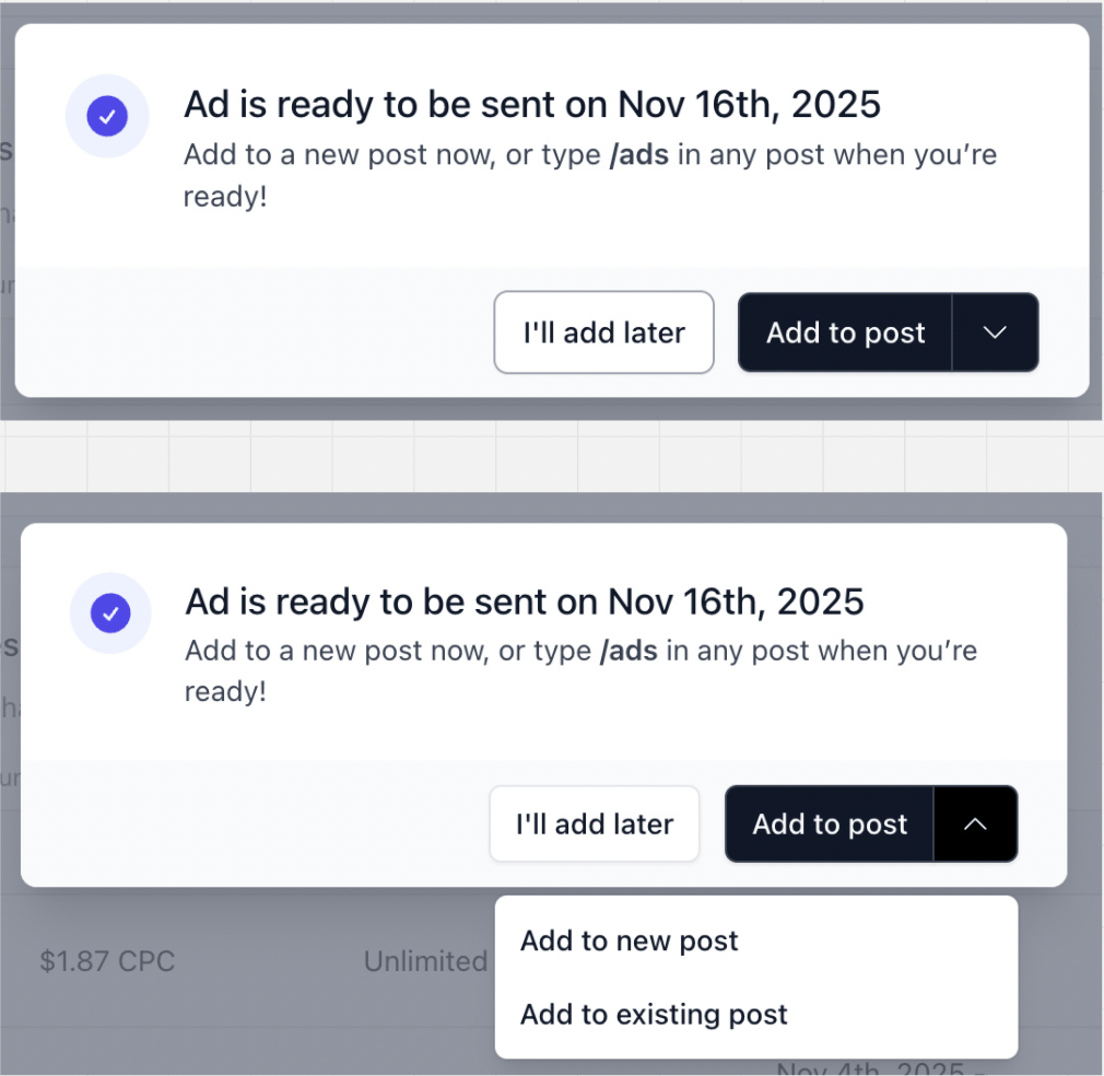
Look at this: whenever you've accepted an ad opportunity, you see this screen. You can either add it to the issue you're writing right away, add to an existing draft, or do it later. These are focused, clear CTA’s that keep you on a specific path, make you commit and clearly push you towards the goal.

Seems simple, right?
But here's what many other products would do instead: offer you just "Okay" and "Close" CTAs. Something super generic that doesn't speak to your context and doesn't push you towards the target action.
Beehiiv does things differently. Even if they look small, these choices cause a compounding effect that makes the user journey effortless. And more importantly, they stop users from ghosting mid-flow.
Psychology behind why it works
Self-reference effect
When a button says "Add to this issue" instead of just "Ok / Next," your brain processes it differently. It's not generic anymore – it's about you, about what you're doing right now. That self-relevance makes you remember it better and act on it faster. The CTA stops being something you decode and becomes something you just... do.
Implementation intentions
Beehiiv's CTAs basically create tiny if-then plans in your head: "If I'm writing this issue, then I'll add the ad." Research shows that when actions are tied to specific cues – like the exact moment you're in – you're way more likely to follow through. It becomes automatic instead of something you have to think about.
Commitment & consistency
Even clicking "I'll add it later" isn't neutral. It's a small commitment. And once you've stated intent – even a tiny one – your brain wants to follow through. That's why "Later" isn't just a polite dismissal. It's a hook that keeps you from ghosting entirely.
Mistakes that make users ghost
I'm a huge fan of contextual copy, and I try to implement it with every team I work with. Here are the mistakes and roadblocks we've seen:
Don't make the CTA too long. If it takes a whole sentence to explain what happens next, it's not a good CTA. Remember, people probably use your product from different devices with small screens too.
Adding unnecessary context. If your goal is to take me as quickly as possible through a standard step, any "unusual" text will actually drag my attention, and instead of helping, will hold me back.
Check your design system. Make sure you didn't put contextual CTAs on buttons that are used in many places and are supposed to be universal. Context only works when it's truly specific.
How to implement like a pro
Outline your user journey screen by screen and see where the drop-offs happen. I know, every growth tactic starts here, but it's fundamental. Look at the analytics, look at the support tickets, do user testing.
Some things people never voice. So if you see a problematic step, use this exercise: imagine how this step should look so people are unable to make the wrong decision or bail on it. What distracts them? Can we eliminate it for good?
Remember, it's still a CTA, so keep it tight. Don't write a novel.

If you forget everything, remember this:
Make the next step so obvious they can't mess it up. That's how you keep them.


