Hi everyone!
For those of you in the US — hope you have a great holiday weekend. I don't know about you, but I spent a great couple of evenings with hot chocolate and a book next to a fireplace.
Since it's the holiday season, I have a small request. Would you answer these questions for me below? I'd love to make this newsletter more fun for you and for me.
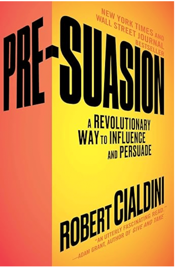
Btw, this is what I'm reading right now—maybe it will make your reading list for this winter too.

What I love about Cialdini's book is it pays a lot of attention not to the moment of the decision but to the context of it. When we work with product growth, we quite often get too tactical: we attack the specific touch point like a pricing page, a home page, or a specific banner where we think the decision is being made, without realizing that people don't come there empty-handed.
They don't just have a problem. That problem fits within their other stream of tasks, timelines, and the potential emotional and social burden of the decision. If we push them down the "quickest path" as we often want to do with activation, sometimes we're ignoring this context, bringing them to a step they aren't ready for yet. The result? Users ghost, get scared, or leave unsatisfied.
Find of the week
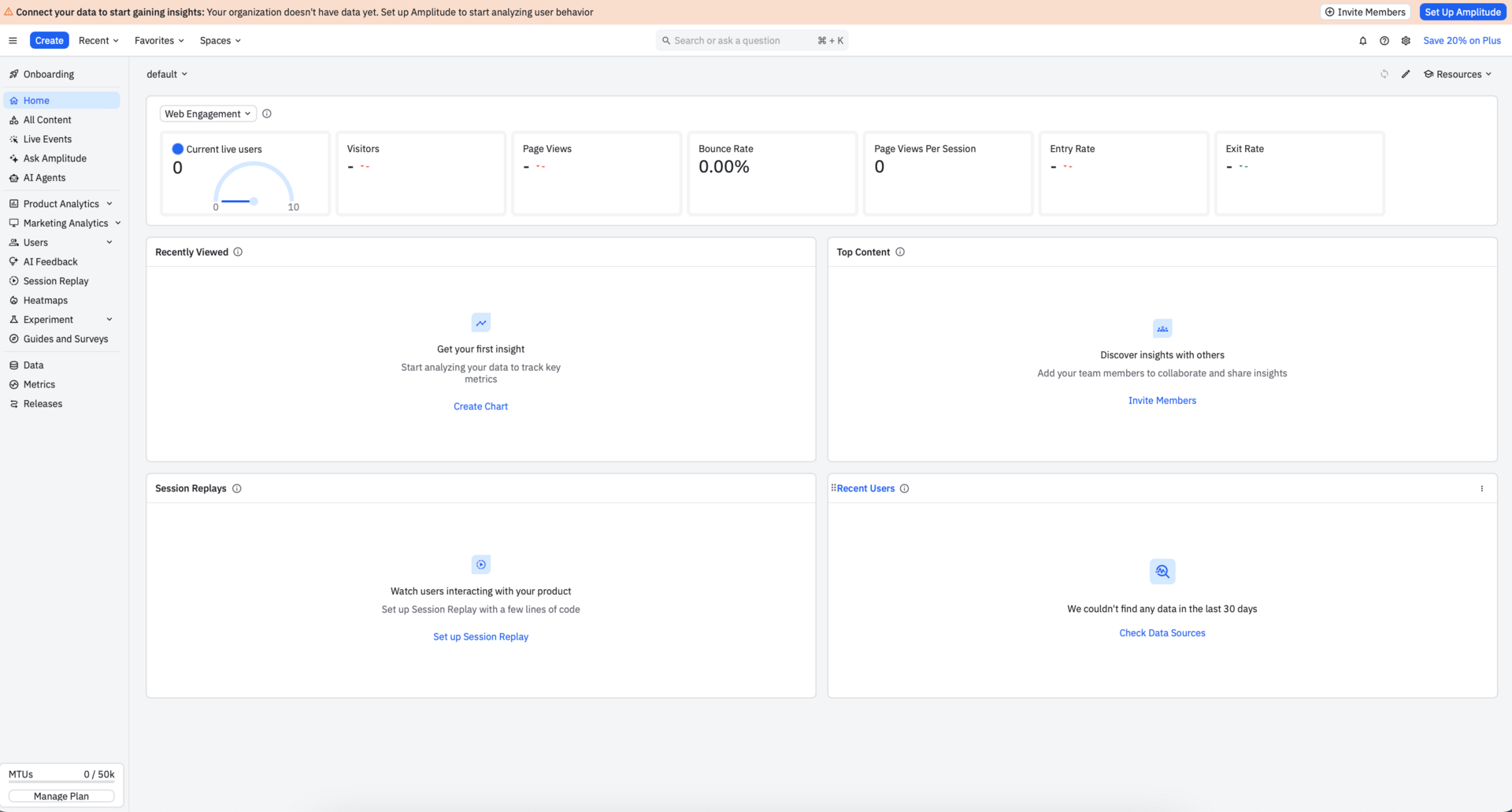
I love Amplitude. I hate their pricing plans, but I love the product. And one of the great things about them is onboarding.
I've set up analytics systems for teams dozens of times. And when you do it from scratch, you always get stuck at this step: you need to invite the developer, connect the data, and only then can you get to work. I know exactly what Amplitude offers, so it isn't a blocker for me. But imagine someone (maybe it's you or one of your colleagues) who is looking for an analytics system for the first time.
They don't know what to expect. They want to understand how the dashboards will look. What features are available. How easy will it be to set up the metrics they want. And guess what: they want to do all of that before they're sending the data connection request to the developer.

Most analytics systems push you to go through the setup before you can play with filters and check out how the internal interface looks. And it makes sense, right? They push you down the shortest path to success — connect the system and see your data.
But in this case, the value moment doesn't come from the real data. It can easily come from placeholder data or even just from the look of the dashboards, events, and filters.
This is what Amplitude does: while prioritizing the setup path, they actually give you an opportunity to skip it and check out how the system looks on the inside. Before you commit to it.

Psychology behind why it works
Ambiguity aversion. People avoid choices they can't picture. When the outcome feels blurry, we stall, postpone, or quietly walk away. If we don't really understand what will happen after we click "Connect," "Upgrade," or "Invite team," we'd rather do nothing than risk stepping into the unknown.
Implementation effort. Before we act, we do a quick mental calculation: "How much time, energy, and coordination will this cost me?" If the first step looks heavy — long forms, integrations, asking a colleague for help — our brain labels it as "too much for right now" and pushes it to later (which usually means never).
Perceived diagnosticity. We're much more willing to commit when the trial or preview actually helps us judge: "Is this right for me?" Experiences that feel close to real use — a realistic walkthrough, a clickable mock, a concrete example of "here's how you'd use it in your day" — give us that confidence. Low-info previews don't, so we stay on the fence.
Mistakes that make users ghost
If you offer people an off-ramp, here's something to keep in mind:
When we lose the main goal. If we send people down an alternative path that isn't a loop back to the next step but simply a hike into a completely wrong direction.
When we give too many alternative choices. If I see 7 next steps I can take, I'll probably get terrified and take a cocoa break.
When the self-serve path doesn't look valuable. It's like the product that says you can explore it for free, but then every single button is locked behind the paywall.
How to implement like a pro
Make sure they'll have something meaningful to see: for example, if they go to the system without data being hooked up, will they be able to test the filters, see the dashboard structure, etc.
The self-serve path (alternative journey) should help users organically take the next step toward experiencing the main value.
Don't give too many alternative choices. I'd say that 3 is the top number of journeys you want to highlight: main, support request and customization, alternative self-serve.
If you forget everything, remember this:
Value can look different to different people, and even the shortest path can destroy activation if it's the wrong one.


