You’ve probably seen it in your analytics:
The middle plan gets the most clicks.
The most upgrades.
And the most… churn?
Weird, right?
You did what the experts say. You priced your tiers with a clear decoy. You labeled the middle plan “Most popular.”
And users bought it.
So why do they vanish?
Here’s what’s really going on:
The Goldilocks Trap
The Goldilocks Effect (or Compromise Effect) says this:
When people are given three choices, they gravitate to the one in the middle. Not because it’s right for them — but because it feels safer than the extremes.
In other words, “just right” is usually just a guess.
That middle plan wasn’t what they needed.
It was just what they defaulted to.
That’s fine when you’re picking a sandwich.
It’s a problem when you're buying software.
Because when a plan doesn’t match your actual use case, you hit friction fast:
– Too many features.
– Confusing workflows.
– Surprise usage limits.
And then? You churn.
Not because the product was bad.
Because you picked the wrong plan for the wrong reason.

Not All AI Notetakers Are Secure. Here’s the Checklist to Prove It.
You wouldn’t let an unknown vendor record your executive meetings, so why trust just any AI?
Most AI notetakers offer convenience. Very few offer true security.
This free checklist from Fellow breaks down the key criteria CEOs, IT teams, and privacy-conscious leaders should consider before rolling out AI meeting tools across their org.
Most pricing pages are built like product menus:
– Plan A: Basic
– Plan B: Pro
– Plan C: Team
And then a list of features so long your eyes glaze over.
But here’s the problem:
People don’t want to compare tiers. They want to find themselves in a tier.
If you show them three columns and let Goldilocks do the work, they’ll pick the one in the middle and hope for the best.
But your goal isn’t to optimize for the first decision.
It’s to match the right plan to the right kind of usage — so they keep using.
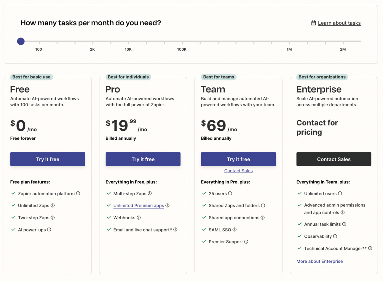
Here’s a move you can steal from Zapier to make it right
Their plans aren’t just labeled “Basic” or “Pro.”
They guide you through a journey:
– Free → For basic one-step automations
– Starter → For individuals testing automation
– Professional → For regular users with multi-step workflows
– Team → For growing teams managing shared Zaps
– Enterprise → For orgs needing customization and security
Each one signals who it’s for — not just what it costs.
So even if someone lands in the middle, they’re more likely to pick a plan that actually fits their level and use case.
Give your users a story. A starting point. A clue about where they belong.
That way, even if Goldilocks still picks the middle — at least it’ll actually fit.

3 steps to break this pattern next week
🔁 Rename your pricing plans to reflect who they’re for — not how much they cost.
🧭 Add a short quiz or selector that asks users: “What do you need this for?” → guide them to the right plan.
✂️ Cut features that exist only to justify higher tiers — especially if users don’t value or use them. Design for fit, not FOMO.

If you forget everything, remember this:
A good pricing plan isn’t just easy to choose — it has to be the right fit to keep.
Because when users pick a plan that doesn’t match their real needs, they churn and never come back.


