Last month, I was driving cross-country from Los Angeles to Atlanta.
By the way — I’m in Atlanta now, if you’re around, let’s grab a coffee.
Anyway.
Turns out, I’m extremely picky about food! Who knew.
But sometimes, we stopped in the middle of nowhere — tiny towns, like 70 people max — and the options were… not great.
So one night, somewhere in Missouri, I had to choose between a random diner with zero reviews and a McDonald’s.
And I caught myself thinking:
I don’t even like McDonald’s that much, but at least it tastes the same everywhere.
At least I know what I’m walking into.
So that’s what I picked — the thing that felt familiar when everything else didn’t.
Ambiguity Aversion
You’ve probably heard it before.
And you’ll probably hear it again — because it shows up in almost every step of the user journey.
People hate uncertainty.
When they’ve seen a brand over and over — in ads, in reviews, on social media — it starts to feel familiar.
Even if they’ve never actually tried the product, they already think they “know” what it’s like.
That’s the trick of brand awareness. It reduces ambiguity.
The product feels more predictable just because it’s more visible.
So when users compare your new product to a famous one, they often choose the familiar name — not because it’s better, but because it feels safer.

How we are making it worse by trying to make it better
Most teams think they can outcompete big brands by doing more things for less money.
On paper, it looks unbeatable — more features, broader audience, lower price, a no-brainer.
But that logic ignores how people actually decide.
Before caring about the “more,” they need to understand what the product does for them and what the outcome will look like.
When your product tries to be everything for everyone, users can’t picture what they’ll get.
The message becomes vague, the result unpredictable, and the safer choice turns into the brand they already recognize.
In reality, you lose not on quality or price, but on clarity.
Because when people can’t imagine the outcome, they don’t move forward.
Here’s a move you can steal from Zoom to make it right
When Zoom launched, it was walking straight into a battlefield.
Skype was everywhere. WebEx owned the enterprise. Microsoft had Teams on the horizon.
All of them were selling more — more features, more integrations, more everything — and somehow it always came with more friction.
Zoom did the opposite.
They didn’t promise “better collaboration” or “enterprise control.”
They promised one simple thing: you can connect easily from any device, and it will work.
No setup. No installation drama. No “IT will get back to you.”
You click the link — it just connects.
Across devices, networks, browsers — it works the same way everywhere.
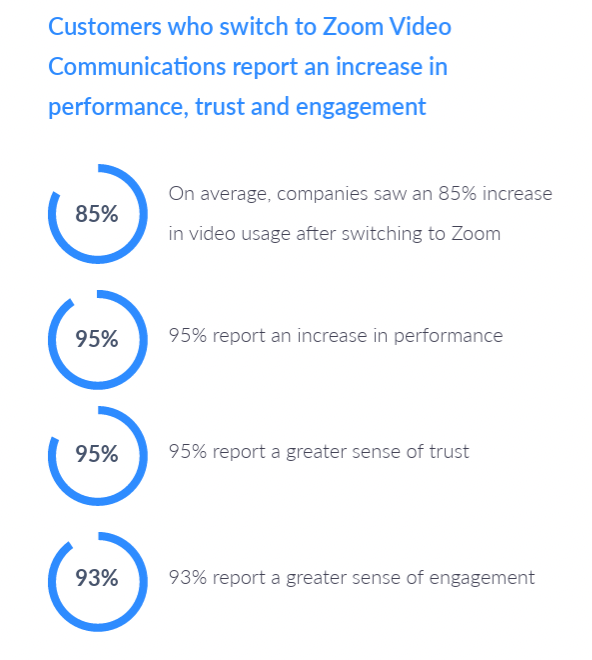
That one choice — to make reliability the product — killed ambiguity.
You didn’t have to hope it would work; you could expect it to.
And that’s exactly how they made a brand-new tool feel safer than the giants everyone already knew.

From explore.zoom.us
3 steps to break this pattern next week
1️⃣ Define one clear segment.
Decide exactly who you want to feel safe saying yes — not “small teams,” but “design leads at remote startups under 50 people.”
Everything else builds from that clarity.
2️⃣ Show the outcome before signup.
Add a short product preview, template, or demo clip that makes users think, “Oh, that’s what I’ll get.”
When they can visualize the result, ambiguity disappears. Btw, if you want another example here, check Amplitude’s demo dashboard.
3️⃣ Frame your offer around certainty.
Don’t compete on “more features” or “lower price.”
Compete on how predictable the first experience feels.

If you forget everything, remember this:
You can’t out-feature the giants — but you can out-clarify them.


