I once worked with an early-stage team that swore their onboarding was excellent.
“Look at the conversion rate,” they said. “It’s amazing.”
And at first glance, it was.
Every new user breezed through sign-up.
The numbers looked beautiful on the dashboard.
But then I started looking closer.
Activation — the actual signal that onboarding worked — was basically flat.
People signed up… and then vanished.
When I brought this up, the team looked at me like I was speaking another language.
“What do you mean people don’t activate?”
“It’s obvious what to do next. Who wouldn’t do that?”
They couldn’t even imagine it.
The action was second nature to them. They’d built the thing.
But to new users? It wasn’t “obvious” at all.
Start learning AI in 2025
Keeping up with AI is hard – we get it!
That’s why over 1M professionals read Superhuman AI to stay ahead.
Get daily AI news, tools, and tutorials
Learn new AI skills you can use at work in 3 mins a day
Become 10X more productive
The Illusion of Transparency
There’s a name for this: The Illusion of Transparency.
It’s the bias where we assume other people see things as clearly as we do.
When you already know the flow, the button, the outcome — it feels impossible to imagine someone else missing it.
But your users don’t share your context.
They don’t know which feature is “the obvious one.”
They don’t see the connections you see.
So what feels self-explanatory inside the team?
Out in the wild, it’s invisible.

How we are making it worse by trying to make it better
Here’s the real trap.
We try to explain our way out of a bad design.
Add tooltips. Empty-state copy. Another email. Maybe even an attached PDF instruction🤦♀️.
But no amount of guides will save you if the flow itself is broken.
Because users don’t want to study your product.
They don’t want to “figure it out.”
If it’s possible to make the wrong move, most people will.
And if it feels too complex, they won’t fight through it. They’ll just leave.
Here’s a move you can steal from Duolingo to make it right
The only real fix is to make the “right” action so obvious users can’t miss it.
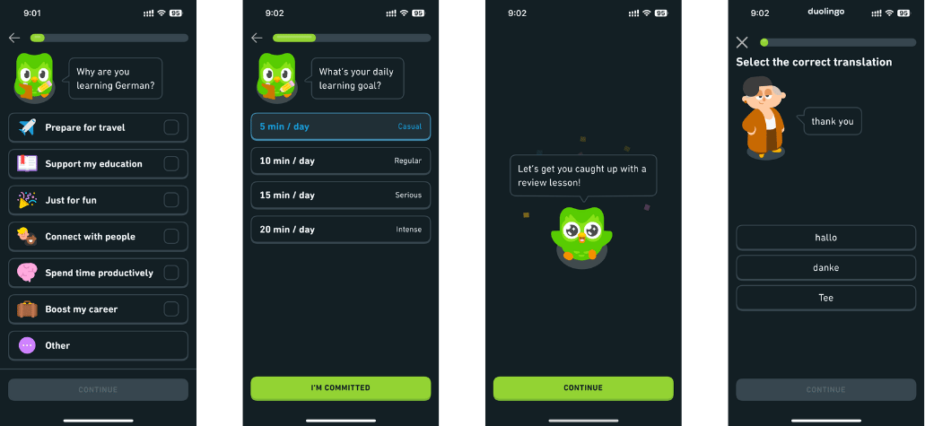
Take Duolingo. They don’t drop you into a dashboard full of menus, tabs, or docs.
The second you sign up, you’re already inside your first lesson.
No instructions. No hovering. Just a simple prompt: tap to translate, match the word, say the phrase.
That design is the opposite of “let me explain how it works.”
It is the work.
By the time you’ve clicked a few times, you’ve already done the core action — learned something.
And that’s the key: instead of hoping users will read tooltips or emails, drop them directly into the core loop so they can’t do anything but experience the value.

3 steps to break this pattern next week
Run a silent test — Sit with a new user and ask them to go through your onboarding. Don’t explain. Watch every hesitation, every pause, and then ask them to explain what felt unclear.
Compare first sessions — Look at the difference between users who activate and those who drop off. What did the successful ones manage to do in their first session that the others didn’t? That’s your real activation signal.
Map the path — Write out every step of your first session. Spot where users start wandering off. Then ask: how can you drop them straight into the right state, the right outcome, without giving them a chance to pick the wrong path?

If you forget everything, remember this:
Don’t explain clarity. Design it.


